
Step 1 : Creating Home Page
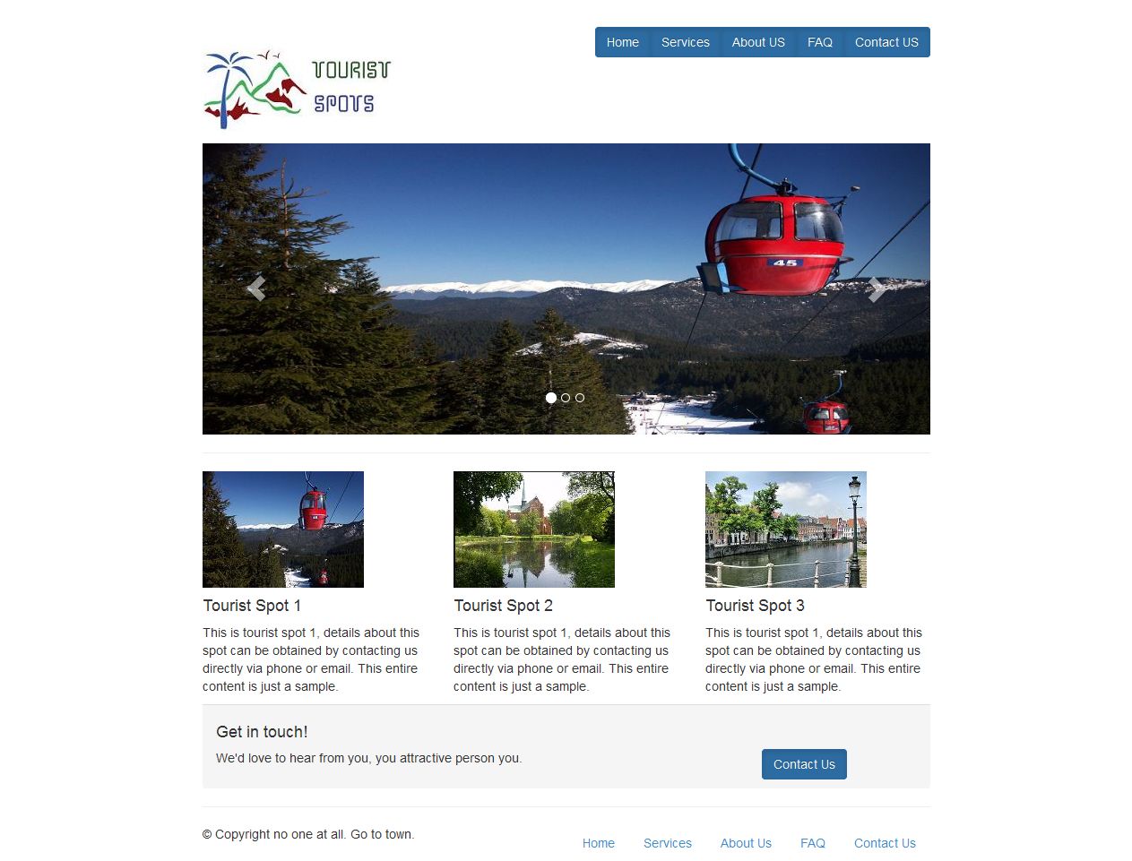
In this tutorial, We will create Tourist Spot Home Page like this image.
Step 1.1: Creating Tourist Spot Layout
Step 1.1.1: Create empty html file and add title, path of bootstrap javascript files and bootstrap css files like below.
<!DOCTYPE html>
<html lang="en">
  <head>
    <meta charset="utf-8">
    <meta http-equiv="X-UA-Compatible" content="IE=edge">
    <meta name="viewport" content="width=device-width, initial-scale=1">
    <meta name="description" content="">
    <meta name="author" content="">

    <title>Grid Template for Bootstrap</title>

    <!-- Bootstrap core CSS -->
    <link href="dist/css/bootstrap.min.css" rel="stylesheet">
	<link href="dist/css/bootstrap-theme.min.css" rel="stylesheet">
    </head>

  <body>

  <script src="js/vendor/jquery.min.js"></script>
  <script src="js/bootstrap.min.js"></script>
  </body>
</html>
Step 1.1.2: Create page header which contain logo in left side and links in right side by just add this below code.
<div class="row" style="padding-top:30px;">
    <div class="col-md-3">
      <h1><img src="logo.jpg"/></h1>
    </div>

    <div class="col-md-9">
      <div class="btn-group pull-right">
  	  <button type="button" class="btn btn-primary active">Home</button>
     	  <button type="button" class="btn btn-primary active">Services</button>
	  <button type="button" class="btn btn-primary active">About Us</button>
      	  <button type="button" class="btn btn-primary active">FAQ</button>
      	  <button type="button" class="btn btn-primary active">Contact Us</button>
      </div>
    </div>
</div>
Step 1.1.3: Save the header and open it in your favorite browser, the web page will look like,

Step 1.1.4: Create page footer using below code.
<footer>
 <div class="row">
   <div class="col-md-6">
     <p>?? Copyright no one at all. Go to town.</p>
   </div>
   <div class="col-md-6">
    <ul class="nav nav-pills pull-right">
       <li><a href="#">Home</a></li>
       <li><a href="#">Services</a></li>
       <li><a href="#">About Us</a></li>
       <li><a href="#">FAQ</a></li>
	   <li><a href="#">Contact Us</a></li>
    </ul>
   </div>
 </div>
</footer>
Step 1.1.5: Save the tourist spot layout file and open it in your favorite browser, the web page will look like,

Step 1.1.6: Take a copy of layout page for creating other page.
Step 1.2: We are going to use carousal component for responsive image slider in our home page. Add this below code for carousal element.
<div class="row">
   <div class="col-md-12">

<div id="carousel-example-generic" class="carousel slide" data-interval="3000" data-ride="carousel">
    <ol class="carousel-indicators">
      <li data-target="#carousel-example-generic" data-slide-to="0" class="active"></li>
      <li data-target="#carousel-example-generic" data-slide-to="1" class=""></li>
      <li data-target="#carousel-example-generic" data-slide-to="2" class=""></li>
    </ol>
    <div class="carousel-inner">
      <div class="item active">
        <img alt="First slide" src="1.jpg">
      </div>
      <div class="item">
        <img alt="Second slide" src="2.jpg">
      </div>
      <div class="item">
        <img alt="Third slide" src="3.jpg">
      </div>
    </div>


  <!-- Controls -->
  <a class="left carousel-control" href="#carousel-example-generic" role="button" data-slide="prev">
    <span class="glyphicon glyphicon-chevron-left"></span>
  </a>
  <a class="right carousel-control" href="#carousel-example-generic" role="button" data-slide="next">
    <span class="glyphicon glyphicon-chevron-right"></span>
  </a>
</div> <!-- Carousel -->

  </hr>
  </div>
</div>
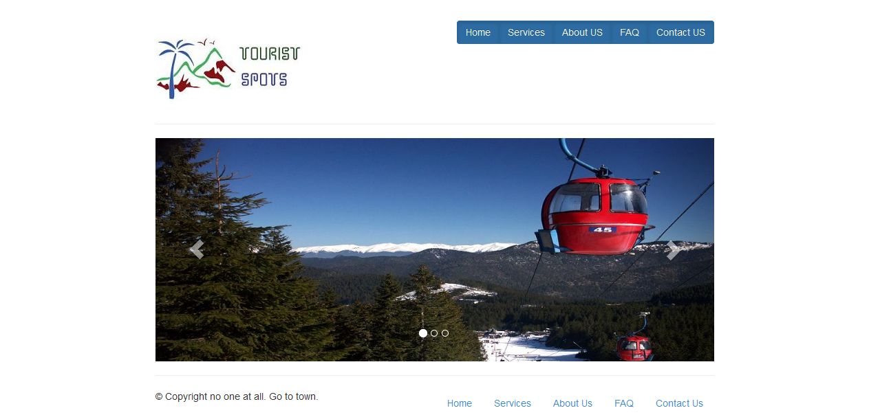
Step 1.2.1: Save the file and open it in your favorite browser, the web page will look like,
Step 1.3: Next create image thumbnails with description and contact us panel by using following codes.
<div class="row">
 <div class="col-md-4">
   <img src="11.jpg"/>
   <h4>Tourist Spot 1</h4>
   <p>This is tourist spot 1, details about this spot can be obtained by contacting us directly via phone or email. This entire content is just a sample.</p>
 </div>

 <div class="col-md-4">
   <img src="12.jpg"/>
   <h4>Tourist Spot 2</h4>
   <p>This is tourist spot 2, details about this spot can be obtained by contacting us directly via phone or email. This entire content is just a sample.</p>
 </div>

 <div class="col-md-4">
   <img src="13.jpg"/>
   <h4>Tourist Spot 3</h4>
   <p>This is tourist spot 3, details about this spot can be obtained by contacting us directly via phone or email. This entire content is just a sample.</p>
 </div>
</div>

<div class="row">
 <div class="col-md-12">
   <div class="panel-footer">
     <h4>Get in touch!</h4>
     <div class="row">
	   <div class="col-md-9">
         <p>We'd love to hear from you, you attractive person you.</p>
       </div>
       <div class="col-md-3">
         <a href="#" class="btn btn-primary active">Contact Us</a>
       </div>
     </div>
   </div>
 </div>
</div>
Step 1.2.1: Save the file and open it in your favorite browser, the web page will look like,
Step 2 >>